UI Challenge
Description
I challenged myself to create a fusion of two video game user interfaces, stepping outside my comfort zone: I transitioned from a flat design, in the style of Nintendo, to a textured design, in the style of AAA games.
I analyzed the two reference designs for each exercise and developed a concise style guide.
Project Breakdown
4 Days
Created using Figma and Adobe
Focusing on Art
Tasks:
Analyse
Wireframe
Iteration
Exercice 01
Main Menu
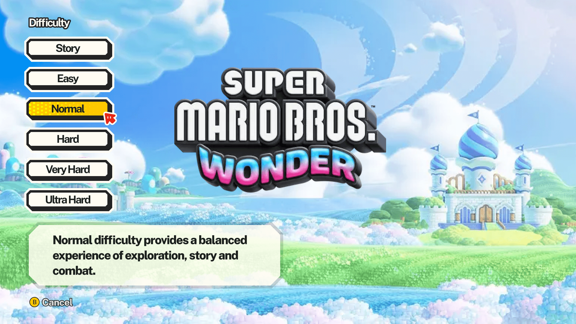
For this first exercise, I focused on a simple art style that I’m somewhat familiar with: flat UI. And as a first step, I tried to recreate the main menu from Horizon Forbidden West but in the style of Super Mario Bros. Wonder.


Style Guide
Since I only had one day to rebuild everything, I analyzed several screenshots from the game Super Mario Wonder and tried to extract as much information as possible from them.
From all that information, I tried to find fonts similar to those used in the game, and I also attempted to do a Color Palette from the UI elements. For the Fonts, I search for a font style that match with the font game. For numbers, the font is mlore condensed and every rotate element is up to 5°.

Settings Menu in Mario Wonder Artstyle
Once I finished the main menu, I decided to move on to the settings screen for Horizon: Forbidden West, which was completely different from the one in Mario Wonder.
From that point on, to be able to iterate more quickly and easily, I created components in Figma and built and updated the UI elements. For the tiling background, I learned how to use additional tools in Figma.


Exercice 02
Main Menu
For this second exercise, I focused on a style that is more textured. To complement this reference, I selected a game that is not too close from the Japanese art.
Doing the main menu help me understand base of the art style.


Style Guide
Since I only had one day to rebuild everything, I analyzed several screenshots from the game Ghost of Yotei and tried to extract as much information as possible from them.
From all that information, I tried to find fonts similar to those used in the game and for this, I had to find 2 fonts: one for the header and title ans one for the body text.
I also attempted to do a Color Palette from the UI elements. It wasn't difficult because the UI background is white, the elements is black and the highlights are majoritarlly yellow.

Inventory in Ghost of Yotei style
For this menu, I tried to gather as much information as possible about the layouts, how to highlight the selected elements, and how to add contrast.
I also took some assets and inspiration from Ghost of Tsushima because it's basically the same Art Direction.